Forecast Cones
A plain-language map of where price could travel next — and how to read it on your chart without fooling yourself.
⚠Cones show price boundaries, not price direction.A probability map, not a prediction
A forecast cone is a series of calculations that estimate the range of prices an asset is likely to stay within over the coming hours and days — drawn straight onto your chart as a fan that opens toward the future.
The engine learns how this specific asset behaves — how much it normally moves, how violently, how often it gaps — then simulates thousands of possible futures from the current price. It keeps the statistical edges of all those futures and draws them as lines. The middle line is the most ordinary outcome; the outer lines are the rare ones.
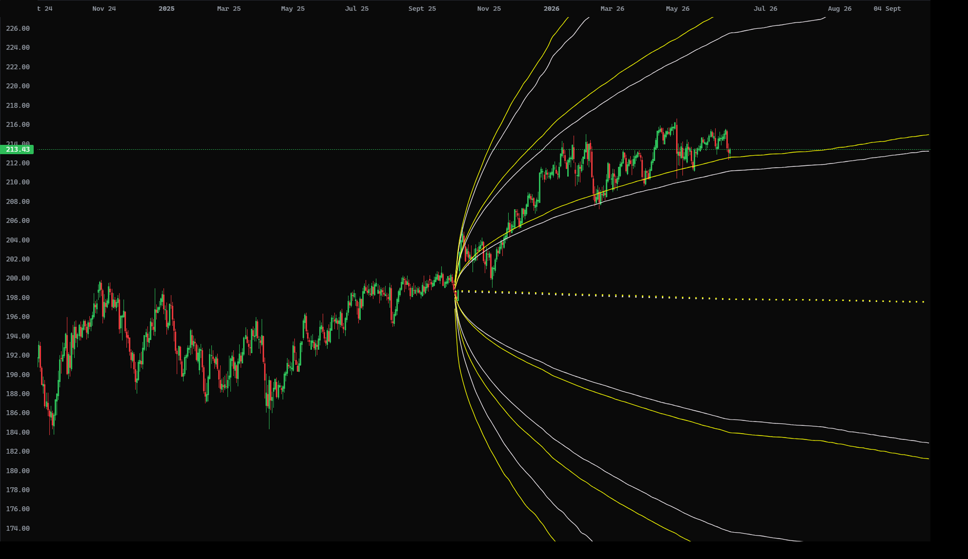
Is this real math or marketing?
Real, and old. The same engine — Geometric Brownian Motion simulated by Monte Carlo — is the foundation of the Black–Scholes–Merton option-pricing model that won the 1997 Nobel Prize in Economics and prices trillions in derivatives every day. We use it to draw a range, not to sell options. Refs: Columbia FE — GBM · Nobel 1997 (Merton & Scholes)
Three cones, three personalities
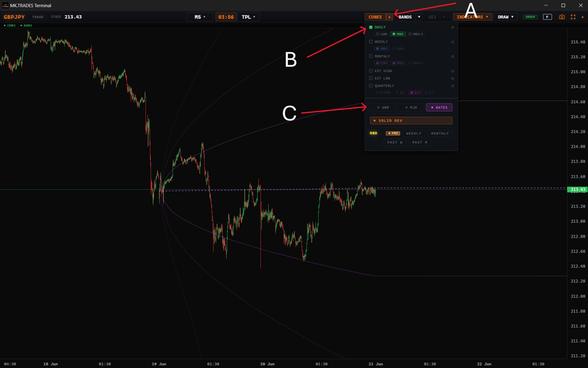
The same chart can show three different cones because there are three engines, each making a different assumption about how the market misbehaves. Switch between them in the CONES menu and compare.
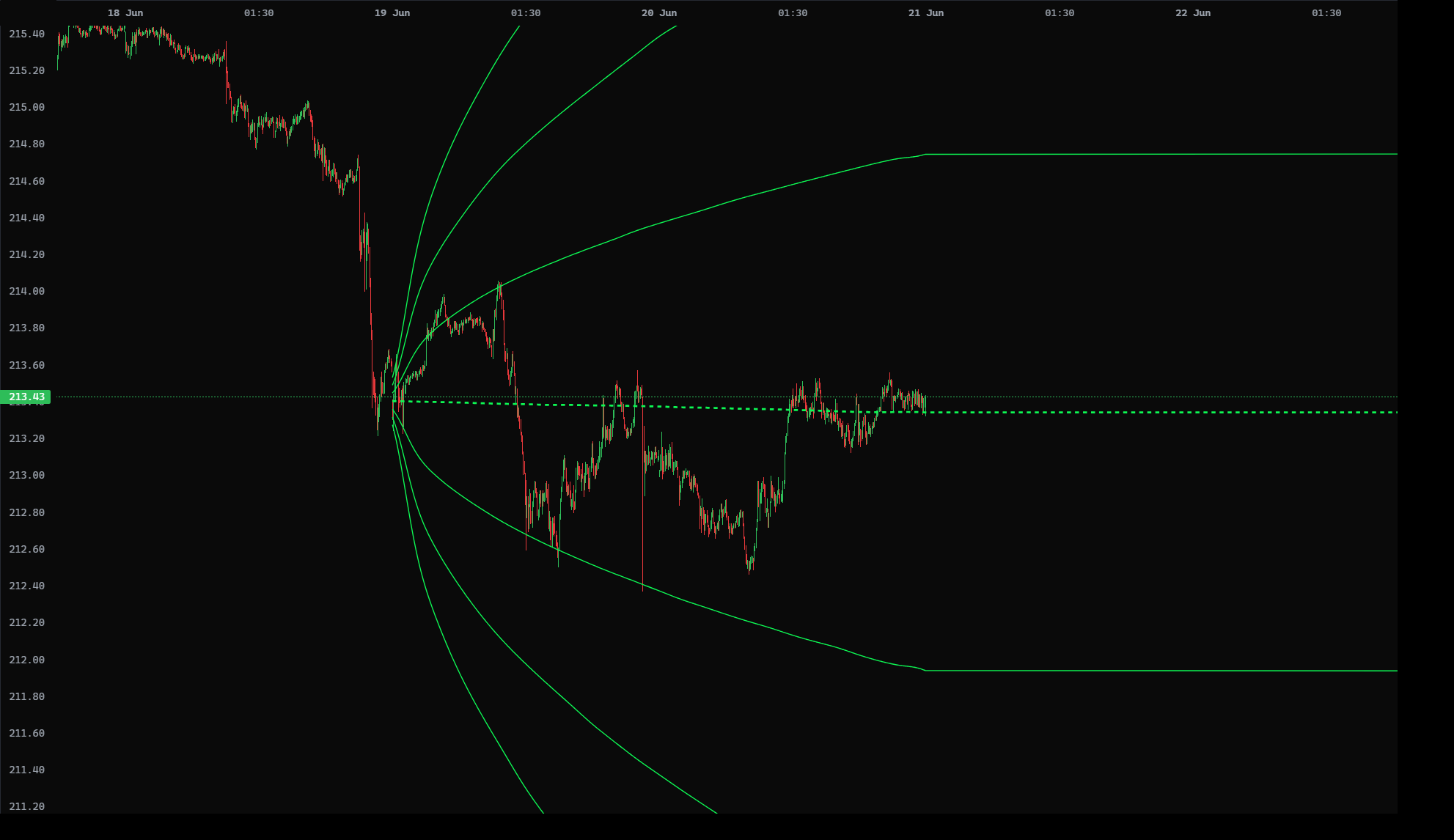
The calm baseline. Assumes price drifts and wiggles smoothly, with no sudden surprises. Cleanest, most symmetric fan.
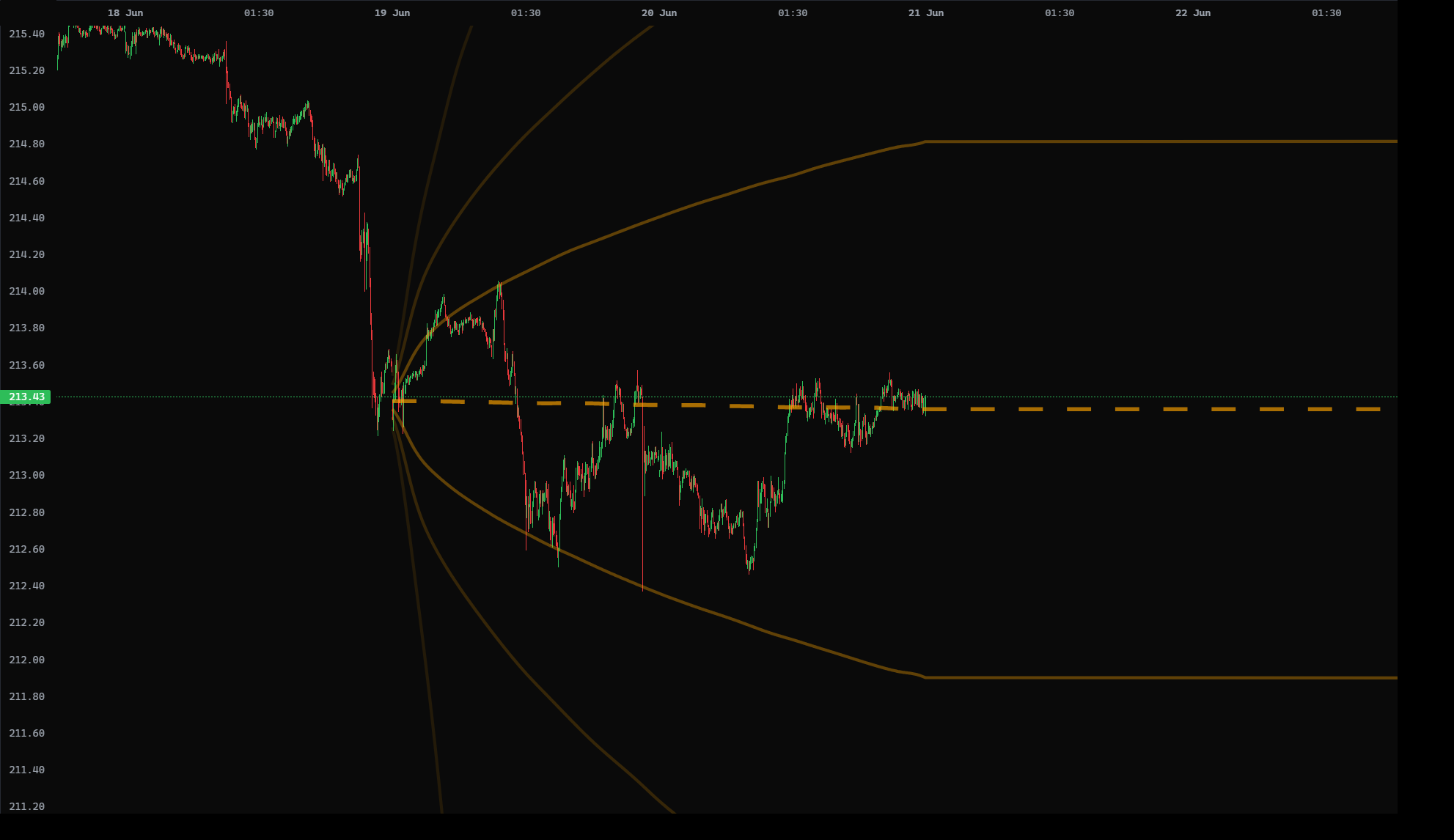
Adds sudden jumps — news, data releases, shocks. The cone allows for price to gap, so the tails open wider and faster.
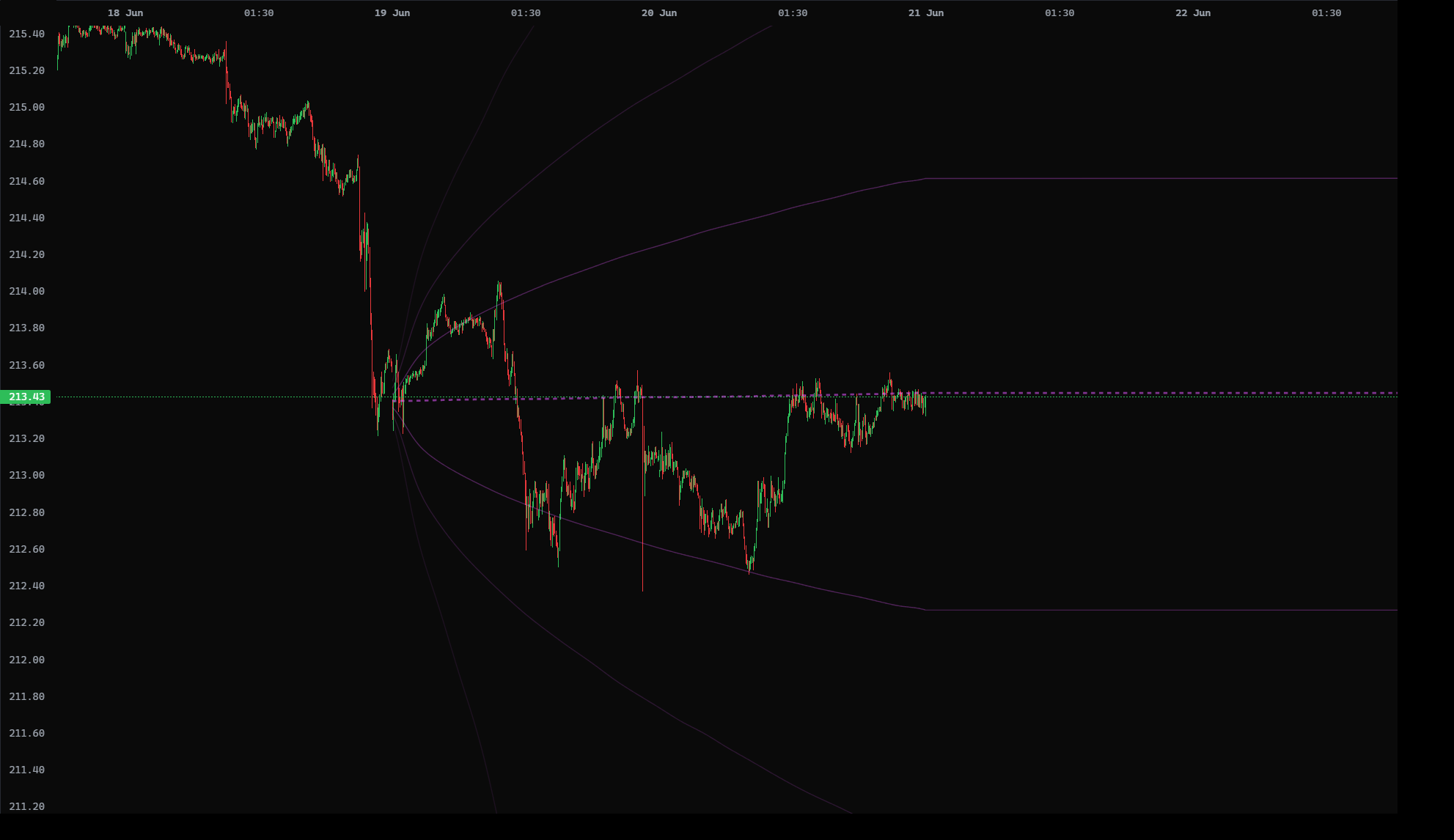
The turbulent case. Allows jumps and a volatility that itself rises and falls. When markets get stormy and stay stormy, this cone is the widest and most honest.
How to think about it
GBM is the calm assumption, MJD adds shocks, BATES adds shocks + a mood that changes. If the three cones agree, the range is robust. If BATES is far wider than GBM, the market is pricing in danger — respect the wider edges.
What each line means
The dotted centre line is the mean — the most ordinary path. Around it sit pairs of standard-deviation bands: SD 1, SD 2, SD 3 above and SD -1, SD -2, SD -3 below. Each band is a measure of how far price has stretched from normal — the further out, the rarer.
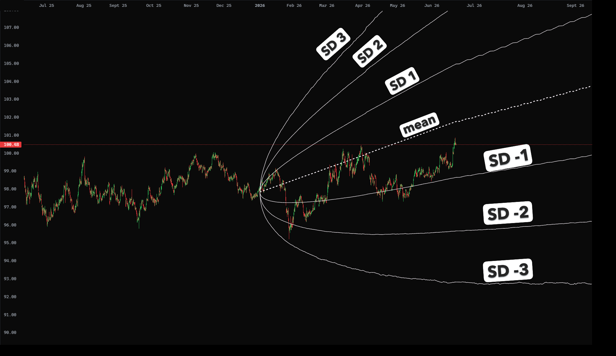
| Band | What it tells you |
|---|---|
| mean | The centre line — the "fair" path. Price drifts above and below it all the time. |
| SD ±1 | The normal zone. Price spends most of its life between SD -1 and SD +1 — nothing unusual. |
| SD ±2 | Stretched. Price has pushed a good distance from fair value — watch for a fade back toward the mean. |
| SD ±3 | Extreme. A rare, far stretch — a true outlier that usually doesn't hold. |
The simple read: price near the mean or inside SD 1 = calm and normal. Pushing out to SD 2 / SD 3 = stretched, watch for a snap back. A decisive close beyond a band = something changed — the market may be leaving its old range.
Turning cones on, on your chart
Cones live in the CONES menu on the main chart. From there you choose the model (GBM / MJD / BATES), the anchor (where the cone starts), and the horizon (how far forward it projects).
Anchors & horizons — different perspectives
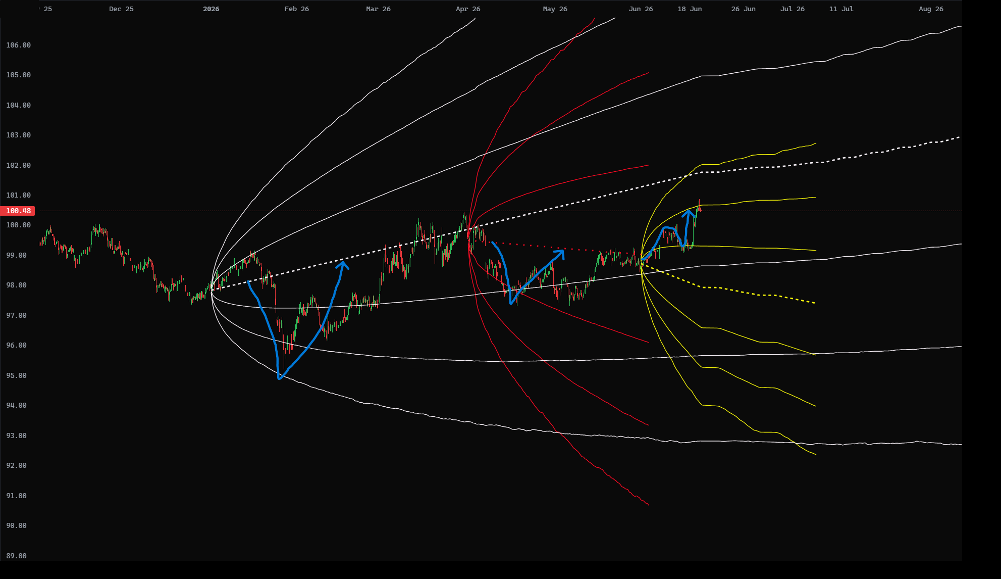
The anchor is where the cone starts. The same asset can carry several cones at once, each anchored to a different point in time, and each tells a different story:
- Quarterly anchor — the big-picture, slow-moving range. The widest cone; your macro bias.
- Monthly anchor — the swing perspective. Where price sits over weeks.
- Weekly anchor — the near-term, tighter range. Closest to the current action.
A cone anchored further back projects a wider fan; a closer anchor stays tighter. Reading them together is the heart of the workflow in section 7.
What a cone is NOT
A cone does not predict price movement
It draws boundaries, not a path. No line says "price will go here." The cone tells you what is normal vs extreme — it is a map of probability, and you supply the trade.
- Not a target. SD 2 is not "where price is heading." It is an edge price rarely passes.
- Not a guarantee. The bands get touched — SD 2 roughly 1 day in 20, by design. A tag is not a broken model.
- Not a signal on its own. A cone is context. Pair it with structure, confirmation and your own plan before acting.
- Not repainting. Once a cone is projected from its anchor it is fixed — it does not move, redraw or repaint as new candles print. A different anchor simply gives you a different cone; each one stays locked to where it started.
Revert, or break
Almost everything price does around a cone is one of two stories: it reverts from a band back toward the mean, or it breaks a band and continues to the next one. The cone never tells you which will happen — but it tells you where: the bands are the most probable places for price to turn, and the next band is the most probable target if it breaks. That is the edge — probabilities that add confidence to your own analysis.
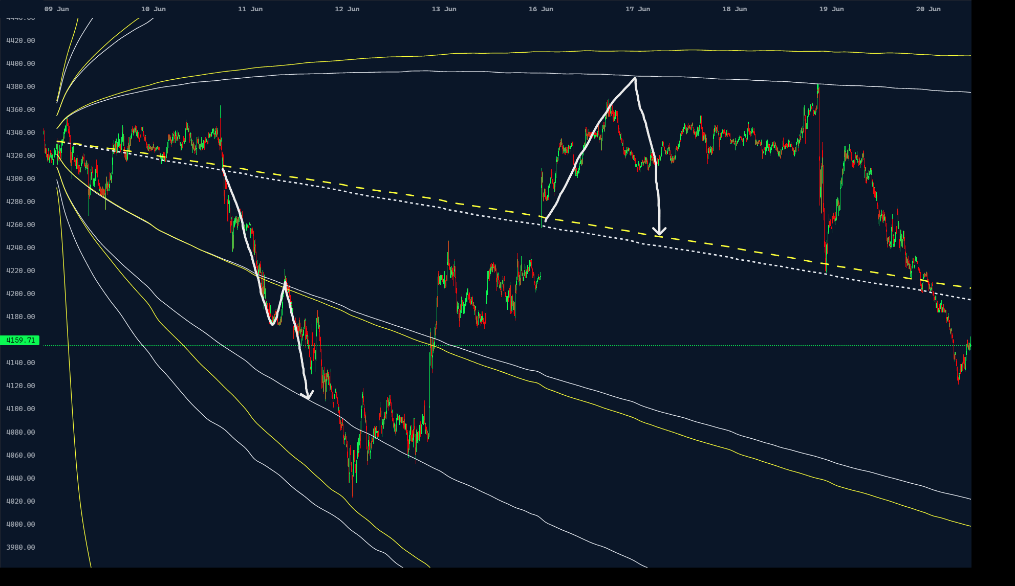
① Mean reversion — rejected at the band
Price pushes from the mean out to SD 1, gets rejected right at the band, and travels straight back to the mean. The band became the ceiling the cone said it most likely would — a textbook reversion.
② Break & retest — continuation to the next band
Price breaks SD -1, rallies back to retest it, but the broken band now acts as resistance and rejects the retest — so price continues to the next target, SD -2. When a band breaks cleanly, the cone shows you where price is most likely heading next.
Coincidence, or the math?
Both reactions landed on exact levels calculated days before — and one was an aggressive rejection on a news event. Why would price bounce precisely off the mean the moment a headline hit? Not luck. The cone is a real estimate of the asset's price drift and volatility; when price reaches a level the math already flagged as stretched, the odds of a reaction are genuinely higher. It won't be right every time — but levels that keep getting respected are doing exactly what the calculation predicted.
Top-down: from bias to entry
The strongest way to use cones is as a drop-down analysis — read the big picture on a higher timeframe, then zoom in for the entry. The higher timeframe gives you bias and range; the lower timeframe gives you timing.
- Start high. On a higher-timeframe cone, find where price sits in the range. Near the lower edge → upside bias. Near the upper edge → downside bias. Mid-cone → no edge, stand aside.
- Note the boundaries. Mark the higher-timeframe SD 1 / SD 2 bands. These are your zones of interest — where reversion or breaks are most likely to matter.
- Drop down. Switch to a lower timeframe at one of those zones. Now you are looking for the trade at a level the big picture already flagged.
- Wait for confirmation. Reversion (rejection wick, failure to extend) or break-and-retest of the lower-timeframe mean. No confirmation, no trade.
- Trade with the higher-timeframe bias. Take entries that agree with the big-picture read. Targets: the next cone line. Invalidation: a decisive close beyond your zone.
Quick checklist
Where in the range? (band = interesting, middle = wait) · Which model? (calm = GBM, event = MJD, storm = BATES) · Revert or break? · Confirmed on the lower timeframe? · Does it agree with the higher-timeframe bias?
Worked example 1 · Daily cone on 5-min Gold
A short setup. The daily cone is projected onto a 5-minute gold chart, so the daily mean is the level in play. Watch how patience and confirmation build the trade — the labels A → D run in order.
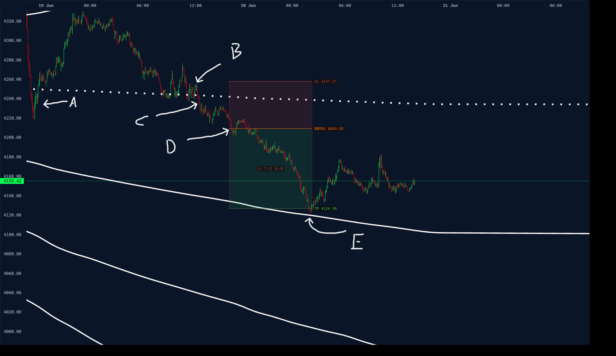
- A — First mean break: do nothing. Price broke the mean, but with no confirmation we stay out. It went straight back up — no trade, and the patience paid off.
- B — Accumulation at the mean. On the next approach, price stalls under the mean with multiple rejections — a clear supply / rejection zone forms.
- C — The break. Price breaks down through the mean. Still not an entry — we want confirmation: either a rejected retest or a lower low.
- D — Confirmation: trigger. A 5-minute close below the last internal low — pure price-action confirmation. Now we act.
The trade
Entry: on the 5-min close below the last internal low (D). · Stop: above the last rejection zone (B). · Target: the next most-probable level, SD -1 — or just ahead of it (price doesn't have to touch SD -1 exactly).
Worked example 2 · 4-hour Gold, combining anchors
A long setup after a sharp dip — and a lesson in combining anchors. One cone frames the entry (price stretched all the way to its SD -1), while a longer monthly cone frames the targets. When levels from two different anchors line up, the read gets stronger.
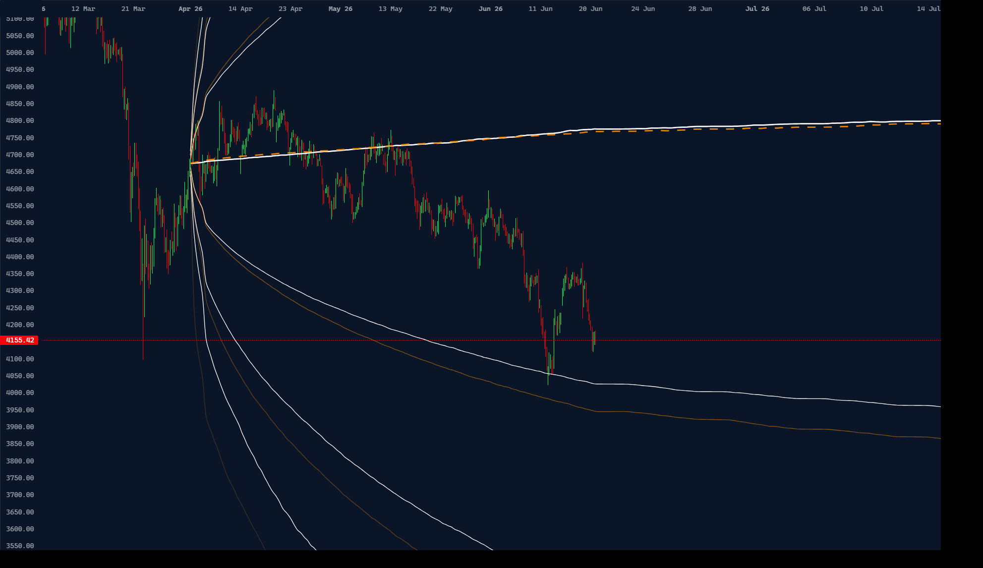
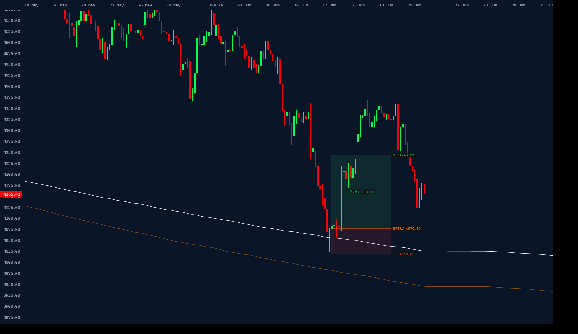
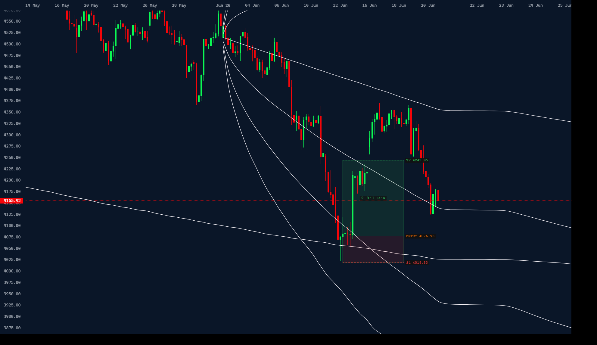
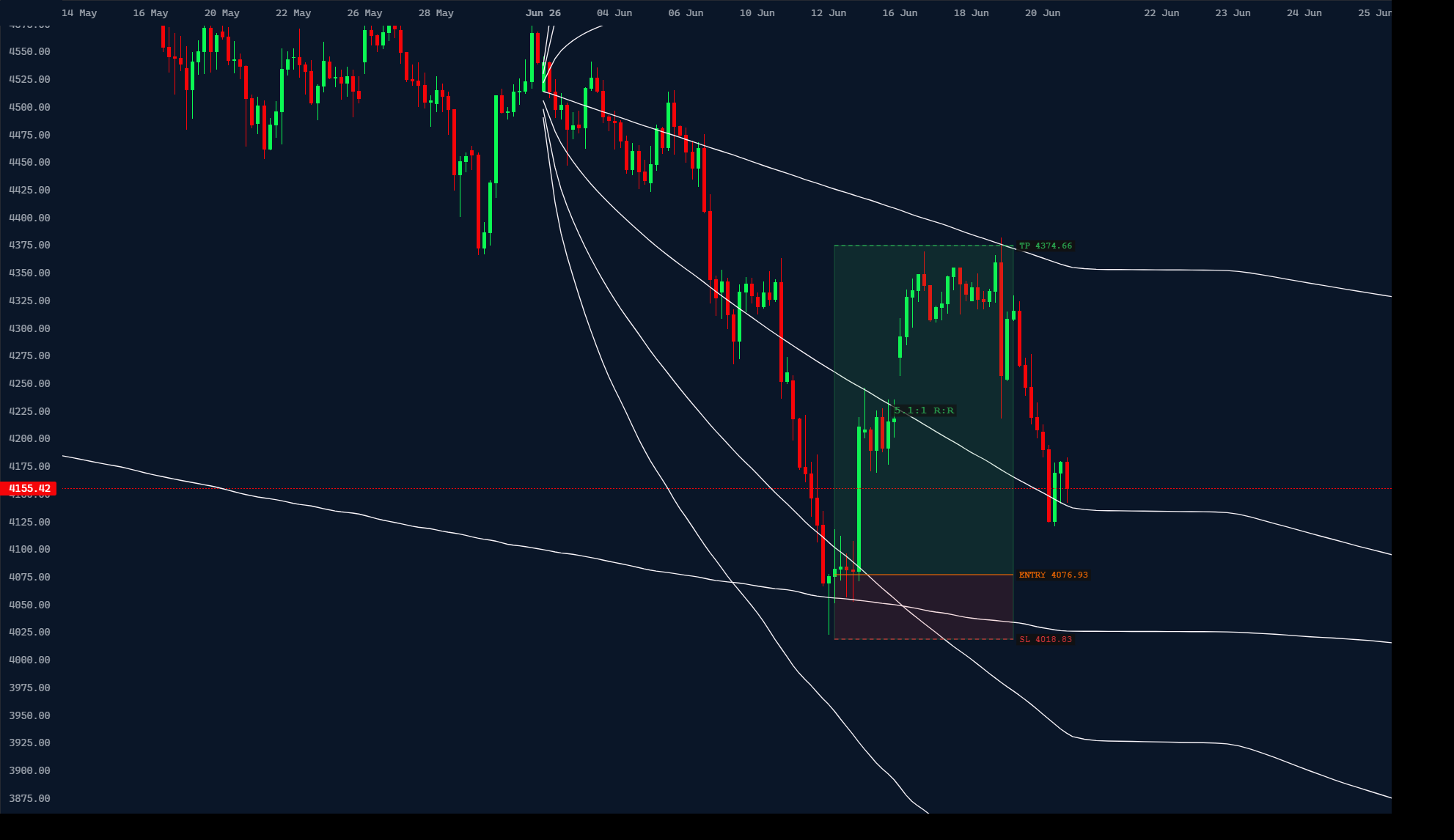
Combining anchors
The entry came from one cone's SD -1; the targets came from the monthly cone — its next deviation, then its mean. Price reacted at lines drawn from two different anchors, and that confluence is exactly what raises the probability. Read the anchors together: the closer cone times the entry, the bigger cone maps the destination.