Options Heatmaps
The options market, painted straight onto your price chart — so you can see the strikes that act like walls, magnets, and battle-lines before price gets there.
▦3 types of heatmap × 2 expiries each = 6 maps you can layer on the chart.The options chain, drawn on the chart
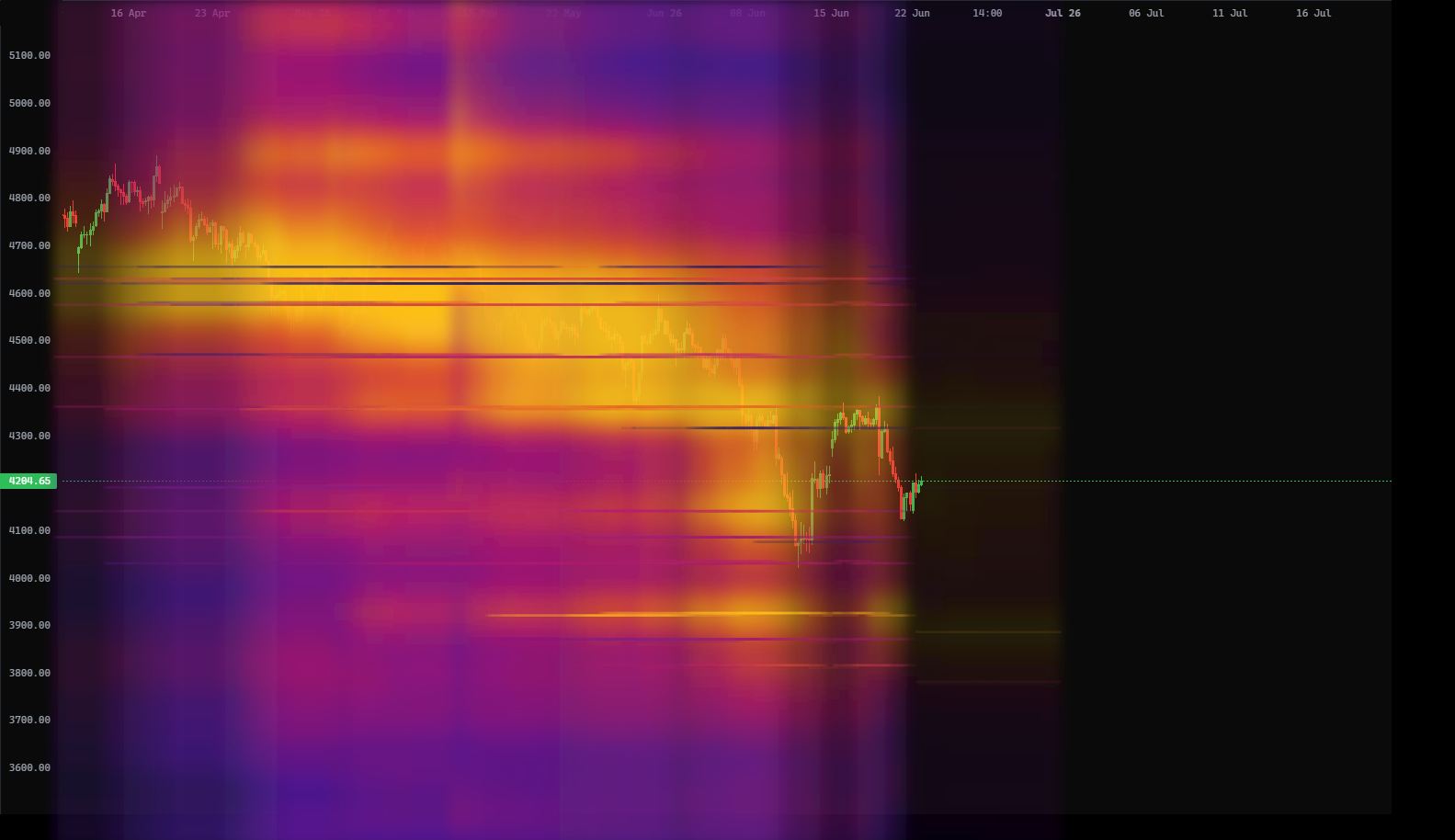
Behind every market sits an options chain — thousands of contracts stacked at different strike prices. An options heatmap takes that chain and paints it onto your chart as colour at each price level, so the strikes that matter light up exactly where price will meet them.
MK.TRADES gives you three different heatmaps, each measuring the chain a different way, and each available in two expiry horizons. That's 3 × 2 = 6 maps you can switch on and off independently from the HEAT menu.
Three ways to read the chain
Each heatmap answers a different question about the same options chain. Turn them on one at a time to learn what each looks like, then combine them.
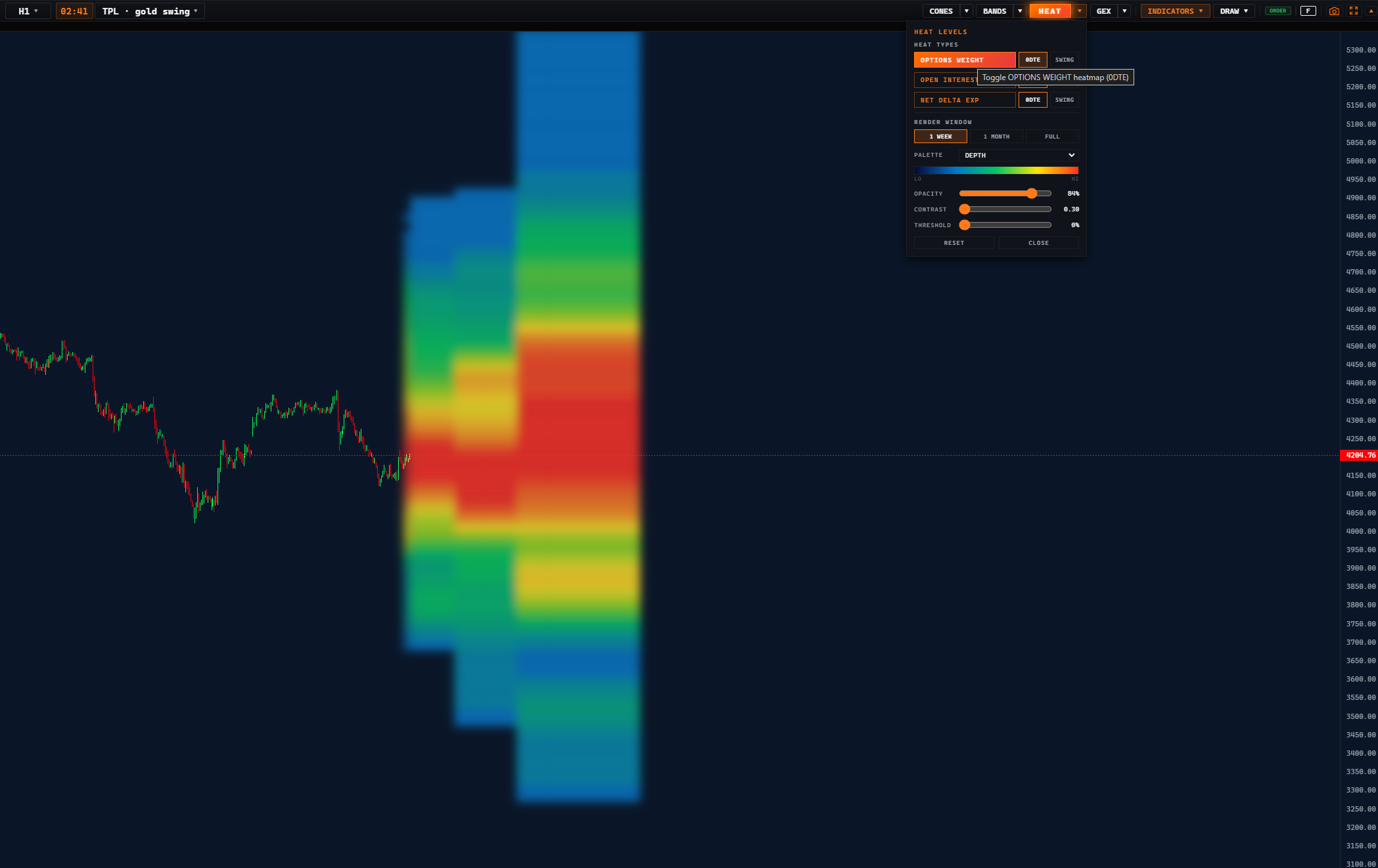
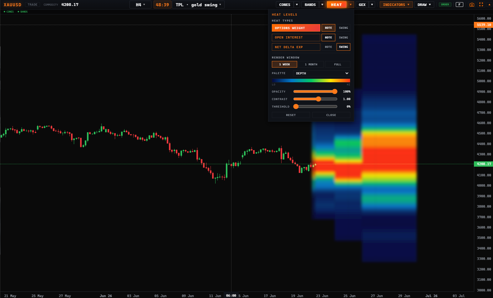
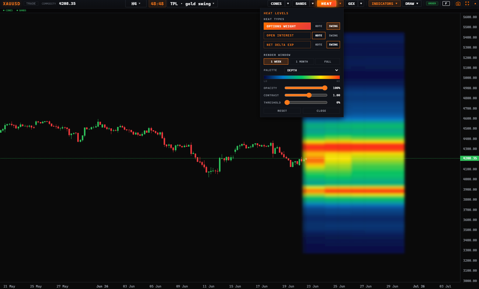
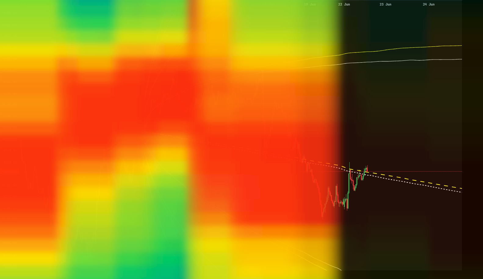
What it shows: where option activity and value concentrate across all strikes — a dense, smooth grid. The brighter the cell, the more option weight sitting at that price.
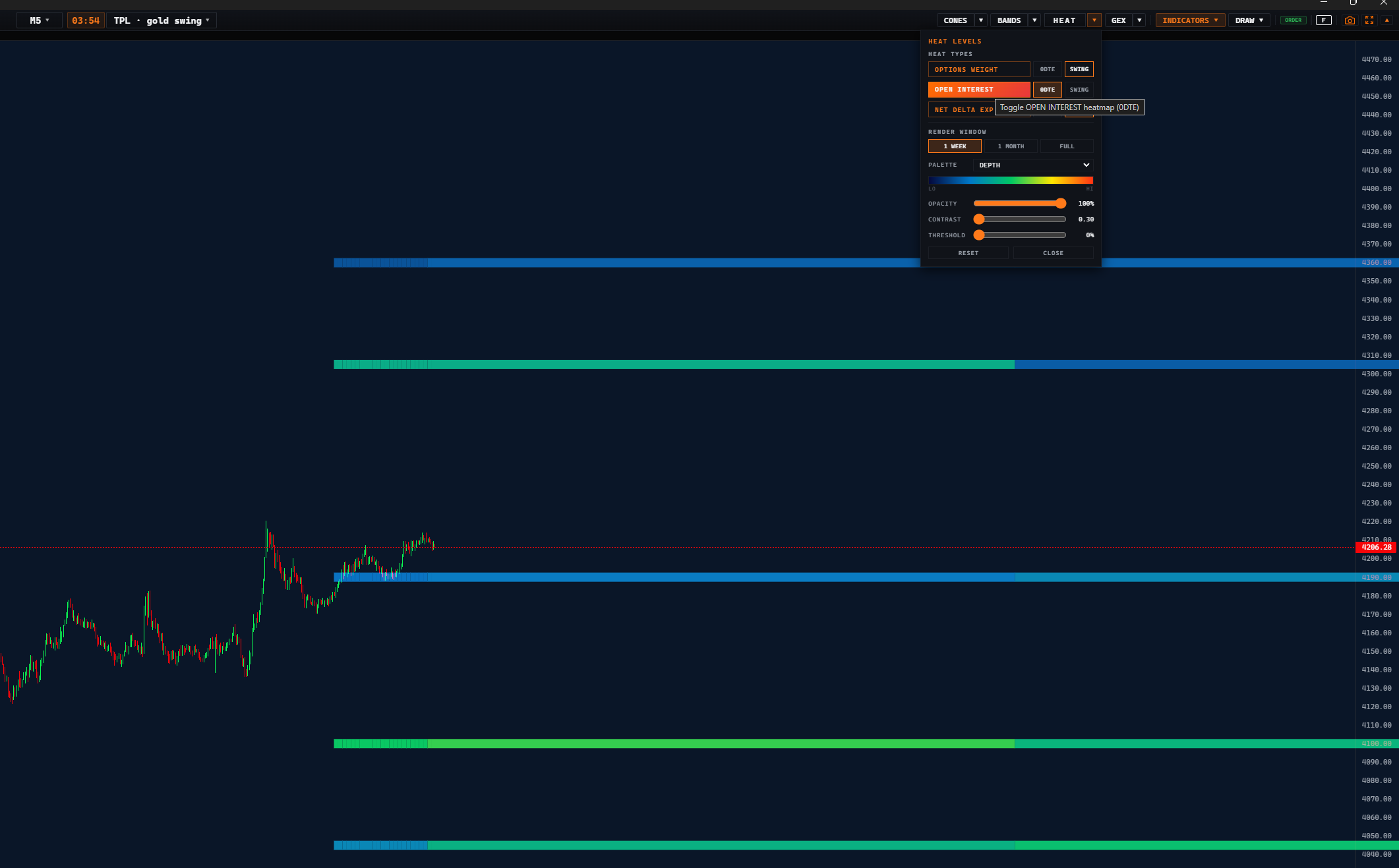
What it shows: how many contracts are open at each strike — drawn as horizontal walls. A tall wall = a strike packed with positions that tends to act as support or resistance.
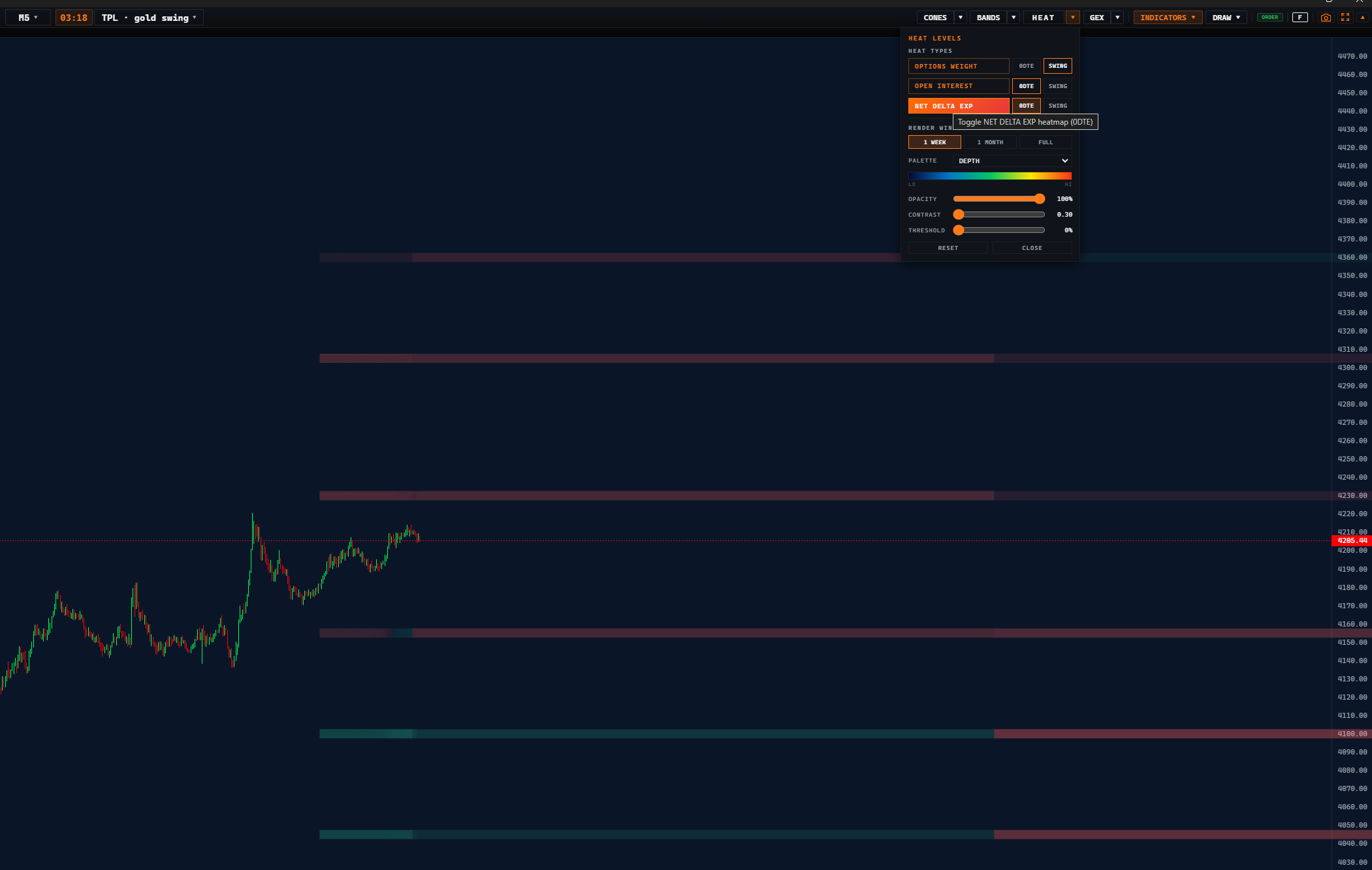
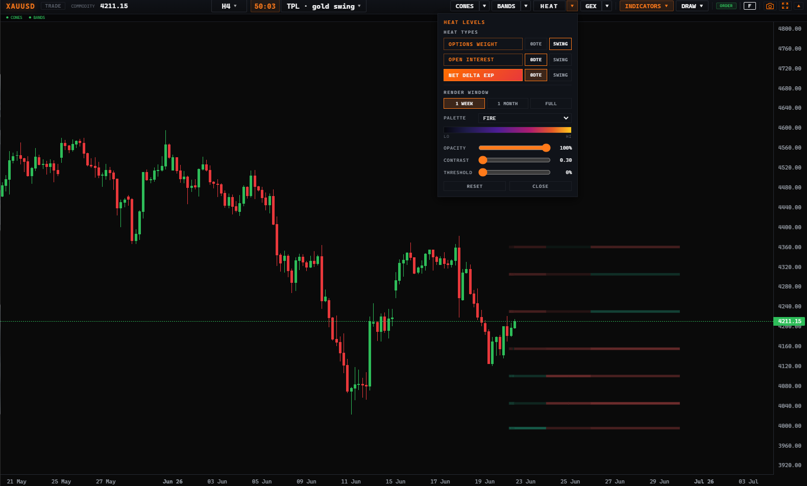
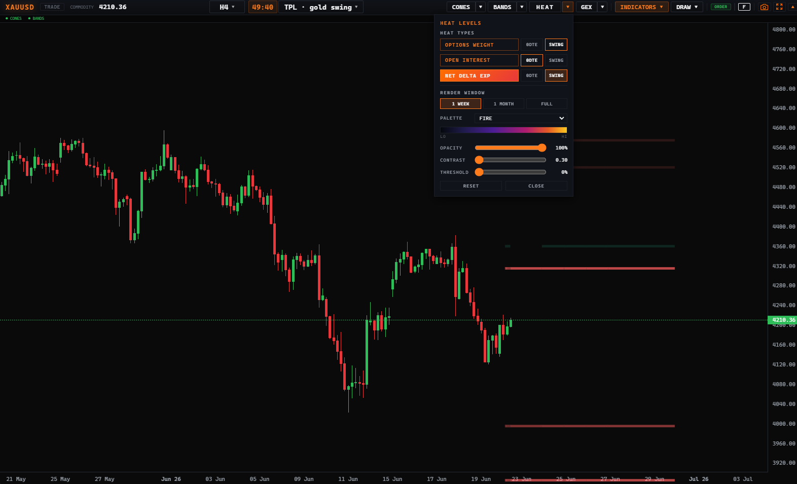
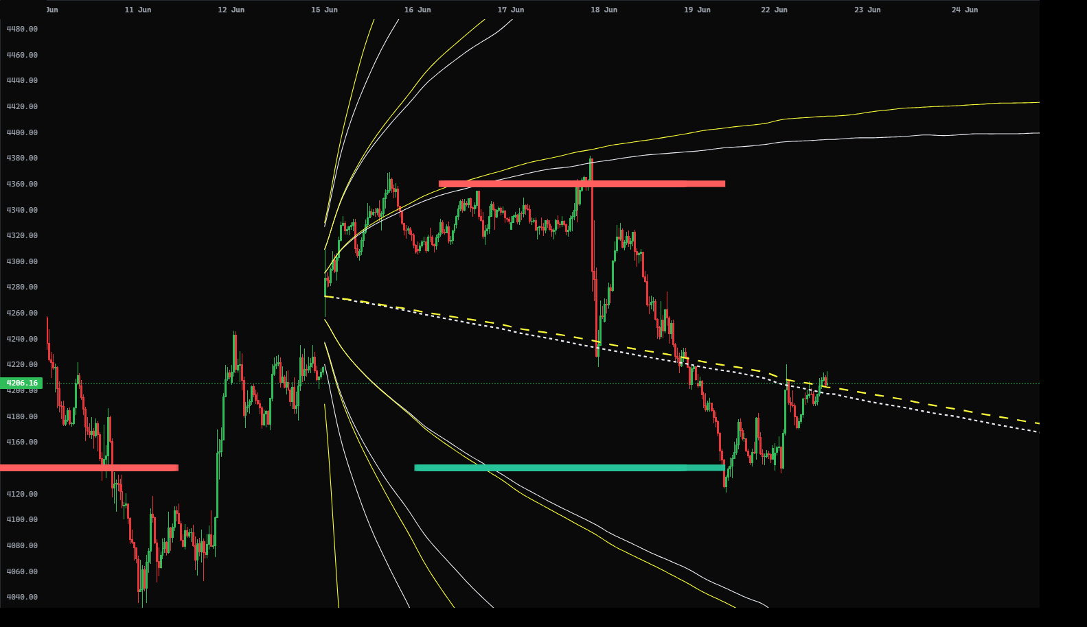
What it shows: the directional lean at each strike — also drawn as walls, but signed: the colour tells you whether positioning at that level leans long or short.
0DTE vs Swing
Every one of the three heatmaps comes in two flavours, because near-dated and longer-dated options tell different stories. You pick the horizon in the same HEAT menu.
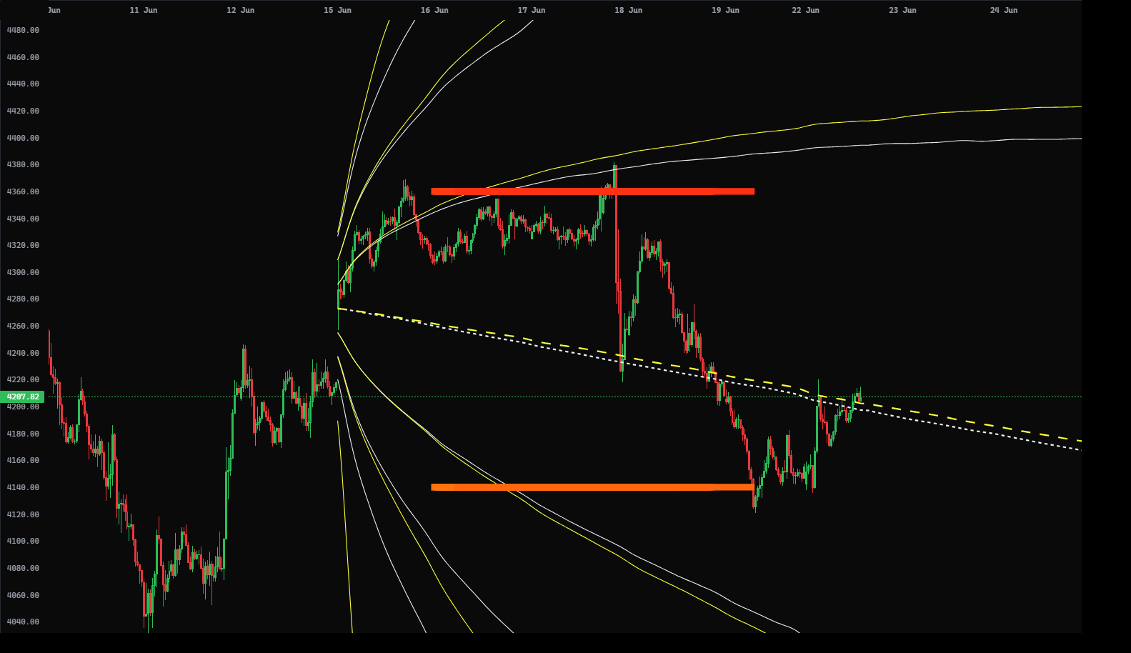
Options expiring today. Tight, fast-moving levels that matter for intraday scalping — where the market is fighting right now. Sparse but sharp.
The full, longer-dated chain. Broader, more stable levels for the bigger picture — the walls that hold over days and weeks.
Options Weight — 0DTE vs Swing
Net Delta Exp — 0DTE vs Swing
How to combine
Use SWING to map the major levels for the day, then switch to 0DTE to time entries against the levels in play right now. When a 0DTE wall lands on a swing wall, that level is doubly important.
Grid vs walls, bright vs dim
- Dense grid (Option Weight) — read the brightness. Bright = lots of weight at that price; dim = thin. Bright bands are zones price tends to slow down in.
- Walls (Open Interest & Net Delta) — read the height/length. A long wall is a strong level; short walls are minor.
- Colour on Net Delta — green leans long/up, red leans short/down. It's the only layer where colour means direction, not just intensity.
- Distance from price — levels right above/below price matter most now; far levels are targets, not triggers.
- Confluence — when two layers (or both expiries) mark the same price, treat it as a stronger level.
Turning heatmaps on
Everything lives in the HEAT menu on the main chart. The labels below match the panel:
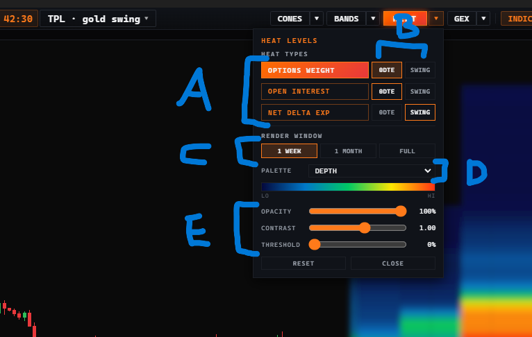
- A · Heat type — pick which heatmap to display: Options Weight, Open Interest, or Net Delta Exp. You can turn on more than one at a time, but it's clearest to read them one at a time.
- B · Expiry — choose the horizon for that layer: 0DTE (today's expiry) or SWING (the longer-dated chain).
- C · Period — how much history the heat covers: 1 WEEK = the current week, 1 MONTH = the current month, FULL = up to about two months of data. FULL is the heaviest to draw and can slow a weaker device — start small and widen only if it stays smooth.
- D · Palette — the colour scheme for Options Weight and Open Interest (e.g. DEPTH: blue = low → red = high). Net Delta is coloured by sign instead, so the palette doesn't change it.
- E · Visuals — fine-tune how the heat looks:
• Opacity — the transparency of the heat over your candles.
• Contrast — how sharply strong levels stand out from weak ones: raise it and the hot zones pop while the faint background fades.
• Threshold — raise it to start removing the weakest levels, leaving only the strongest on the chart.
Walls as levels, weight as zones
Heatmaps don't give signals — they give levels. They tell you where price is likely to react; you supply the trade with confirmation.
- Support / resistance — trade reactions at the tall OI / net-delta walls the way you'd trade any key level: wait for rejection or a clean break.
- Magnets — heavy weight zones often pull price toward them, especially into expiry. A big wall just above can be a target.
- 0DTE for timing — once the swing map sets your bias, use the 0DTE walls to find the exact intraday level to act at.
- Confluence with cones — a heatmap wall that lands on a cone band (see the Forecast Cones guide) is a high-conviction level: two independent models agreeing.
The same setup, seen through the other layers
A few honest caveats
- Levels, not promises. A wall is where a reaction is likely, not guaranteed. Always wait for price to confirm.
- US assets are RTH. On US instruments the heat is placed on regular-trading-hours candles by design — outside-hours placement isn't shown.
- Freshness matters. Over weekends / holidays the options data can go stale; the terminal flags staleness — don't lean on a frozen map.
- Performance. Keep the render window at 1W unless you need more — FULL draws far more cells.